Widgets
Widgets in the Fyne toolkit are designed for a clean and pleasant user interaction, following a standard theme and supporting rapid app development, solid testing and easy maintenance. There are various design considerations that promote that ambition, we explore them in this page.
Behaviour API
One thing that you will notice about the standard widgets is that the API is all about behaviour and state - but very little that controls the actual look of an element. This is by design. It enables our code, and that of app developers, to focus on the behaviour of a widget so that it’s rendering process can be left to other code. This makes it much easier to test, in fact full applications can be run through unit tests in memory without ever having to render the app.
You can extend an existing widget
to add new behaviours without needing to worry about how it is
rendered.
It is also possible to write your own
components, an application is not limited to using the provided
widget set.
When building your own widget you will notice that the rendering
details are completely separate from the state - this is part
of the design mentioned above. A WidgetRenderer (the code that
renders a Widget) typically holds a reference to the widget
that it will be rendering to access state or other information.
When a widget state changes then Refresh() is called - the
renderer will then be asked to refresh and it should update the
display to reflect the new state.
Custom widgets are recommended to use the current Theme but
can choose to specify their own sizes, colours and icons where
that seems desirable.
Content Padding
The standard widgets use the theme specified padding to make
appropriate space around their graphical components.
The widget package uses a standard height and baseline to ensure that
provided layouts will align well by default.
If you are building a custom widget it is recommended to follow these guidelines.
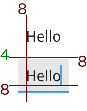
The value of theme.Padding() is used in layouts to space elements
of a container, it creates a consistent space around the various
parts of an application. Some widgets, however, have content that
should be inset from the edges of the extents. Consider Entry,
It has a background and a border that go out to the edges, but its content
should be inset. And so we have standardised the amount of spacing used to
inset so that alignment matches.
The standard inset, or content padding, of a widget is defined as
theme.InnerPadding(). The standard value of padding is 4 and the inner
padding is 8. You can see in Label and Entry how the (text) content
is inset by this much so that their content will align horizontally and
vertically when placed next to each other.
It is recommended that custom widgets include similar dimensions so that they fit well alongside the standard widgets.